I have had my fair share of designing user-facing sites. I started my web designing journey when I was a mere child of 12 — Geocities, Angelfire were the domains of my choice (quite literally) and the world was my oyster. I started out designing and coding my own HTML pages for my Blogspot, and soon ventured out into creating Blogskins for the internet audience. My tools were Adobe Photoshop and Microsoft Frontpage (it ceased to exist in 2003).
20 years later, here we are.
I was tasked with the responsibility of “making the product that our customers will love using.”
My first thoughts? Bring it on. Though through my decade long experience of being in the industry, I haven’t ‘designed’ in the recent years. I’ve only had developed from approved prototypes.
Plus, I was hired as an front-end engineer and not a product designer.
But no matter. I knew I could do it and I was excited about it.
I was a systematic person, there were processes I wanted to do before embarking on the journey of re-creation. But alas, in a start up environment — time is money. I was the first (and only) front-end engineer working on the entire UI/UX portion of the web app. I had control of what I wanted to design, but I had to do it fast.
Design Process:
As a seasoned front-end engineer, I witnessed firsthand the frustrations experienced by users of the existing web app. Driven by a deep desire for improvement, I made the ambitious decision to step into the realms of product design, eager to deliver an exceptional user experience.
Research:
Despite lacking formal education in UX design, I took the initiative to conduct my research using online platforms like Dribbble. I explored various designs, specifically focusing on data visualization, which aligned with my vision for the web app. While drawing inspiration from these sources, I also relied on my instinct to make informed design decisions that would best suit the project.
User Demographics
The target audience for the app has the following characteristics:
- Age Group: 30–50s
Wireframing:

After conducting research on Dribbble and relying on my instinct to guide design decisions for the web app, I proceeded to the next crucial step in the design process: low-fidelity wireframing.
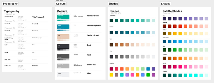
Low-fidelity wireframes serve as the foundation for translating conceptual ideas into tangible layouts. These wireframes prioritize structure and functionality over visual aesthetics, allowing me to focus on the overall user experience without getting caught up in the details.
Using Figjam, I sketched out rough representations of the app’s key screens and elements. This included the placement of buttons, forms, navigation, and other essential components. The goal was to create a basic blueprint that would capture the app’s flow and interactions.
Final Design:

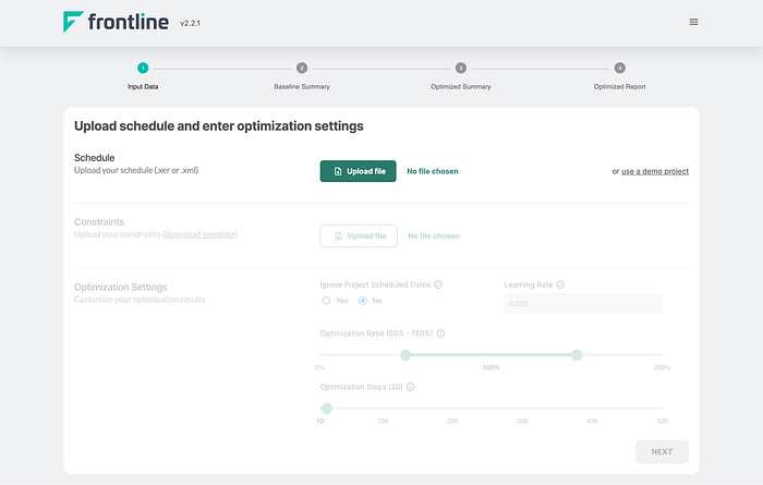
Since users cannot access other pages without logging in, it was unnecessary to display the stepper.

To begin, I gave the login page a much-needed facelift.
The updated design ensures that users understand they cannot create an account independently and must reach out to the sales team for access. Since Frontline operates as a Service as a Solution (ServaaS) and the tiered accounts are still in the early stages, new user registrations require prior vetting.
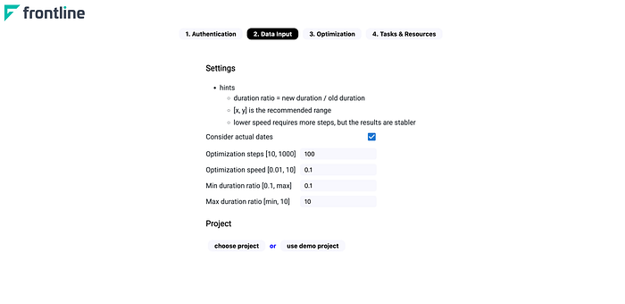
The original version of the landing page lacked a clear flow and hierarchy. It failed to prioritize the data fields, leaving users unsure of where to look or what information needed to be filled in.
To enhance the user flow, I introduced distinct sections that guide users through the necessary steps. The first requirement is to upload a project file, enabling users to proceed to the subsequent fields. As a result, the remaining sections are initially disabled until the project file is successfully uploaded.
(Bonus!)